


#1,706 New Look.
Guys, it’s been eating at my soul lately how indifferent and even… Displeased I am with the Lucky Luxe logo. The current incarnation is just a slightly modified version of the original design I came up with on a 30 minute whim in 2008 when I started a free blog for my freelance work that I decided, on a whim, to call Lucky Luxe.
If I could go back in time, I’d call it Magnolia Street Press or Magnolia Street Paper Co., but alas—it is what it is and now I’m married to it. Ben says he’s the lucky and I’m the luxe, so I’ll let that give me solace in its sweetness.
But I don’t have to be married to the logo anymore. Nope.
I’ve spent many many hours in the last few days, and particularly today, wracking my brain, digging deep into my bag of tricks in search of the perfect flourishes and fonts that capture what the brand is about in a single iconic image—which I think would be modern nostalgia. If such a thing can exist. And Southern. And friendly. And American. And European. Ugh.
I’ve been scanning and reworking vintage map titles from the 1800s, Civil War era sheet music, CV cards, poring over Louise Fili’s entire body of work, searching all things ephemeral and antique… Then pairing with every modern, simple typeface under the sun. I design everything in black, and once I like a logo—only then do I consider color. My design professors in art school told us that a great logo can be drawn with only a black Sharpie. Want to see a tiny, cropped, zoomed in snapshot of what the inside of my head looks like when I get like this?
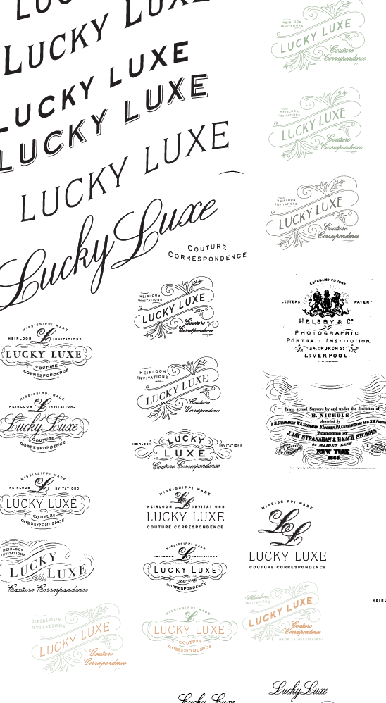
Frustrating. But it’s so… SO… fun.
Though I think the winner winner chicken dinner is there. Can you guess which one? Do you have a favorite? Is there even a way to tell me which one it is if you do? Ginny, if you’re reading this, here’s proof that I sketch in my own way. Mama and daddy, that money you spent on college was apparently worth it.


